Brand guidelines
50 pages
Nothing is rushed. Every step is explained before it starts.
You start light. You can always add, never take away.
The price is written down first, and nobody pushes more.
Talk like a kind nurse who has done this many times. Warm, plain and unhurried.
You tell us what bothers you. We explain the options and the price. Then you decide.
Who buys, what bugs them, and what to say first. Every quote is a real review.
She noticed a line or tired skin and wants help without looking done.
A licensed nurse who listens, explains and keeps it natural.
Looking overdone, the price growing at the chair, and being pushed.
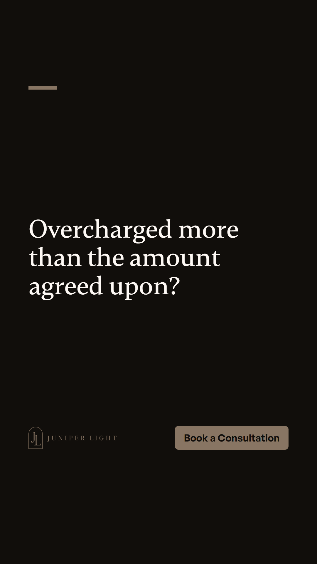
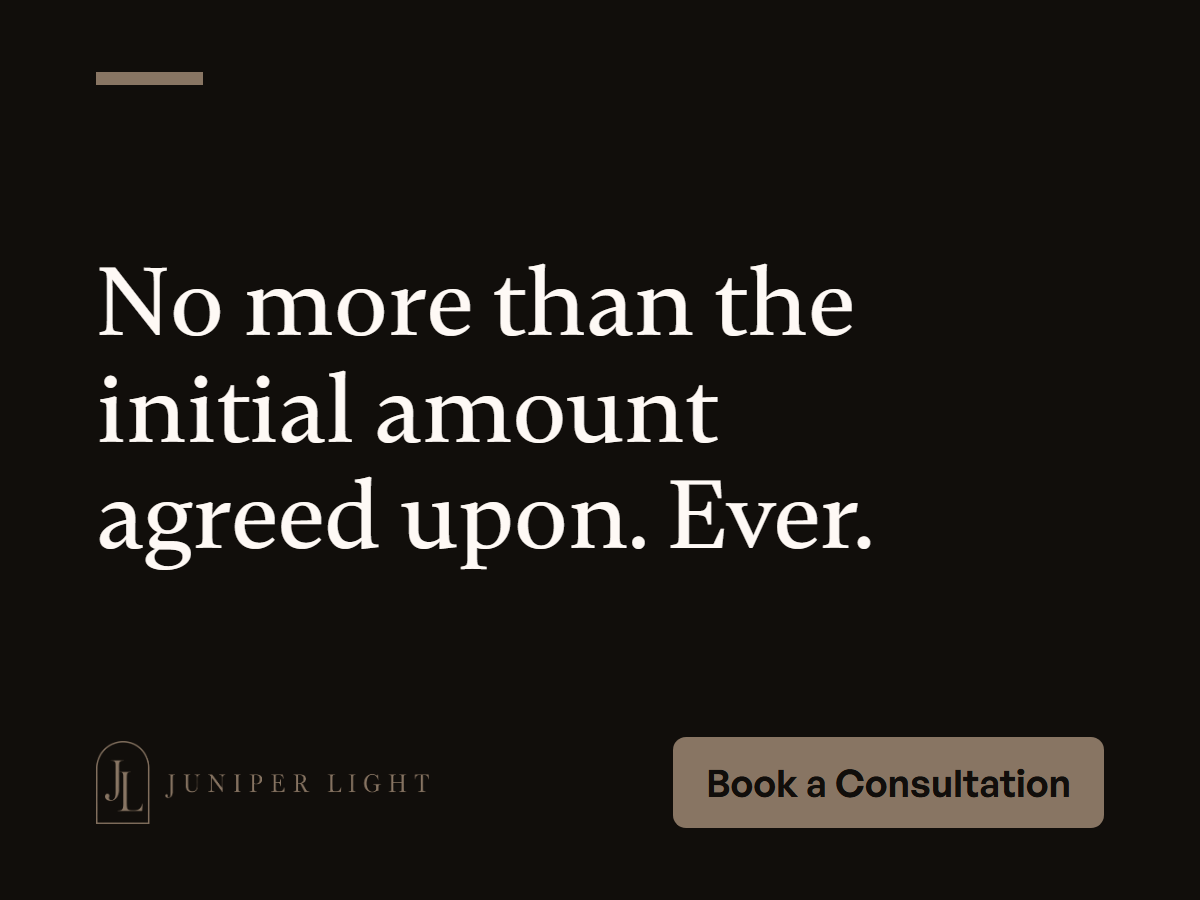
The business committed to treat me, and overcharged me more than initial amount agreed upon.
What real people wrote, word for word. None of it was written for an ad.
The business committed to treat me, and overcharged me more than initial amount agreed upon.
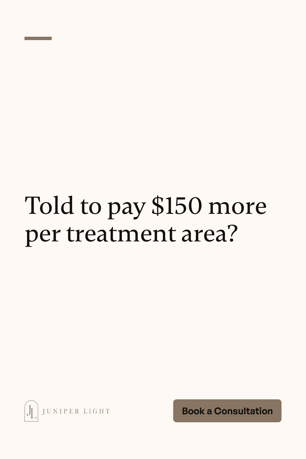
I was then told I could schedule treatment but would have to pay approximately $150 per treatment area.
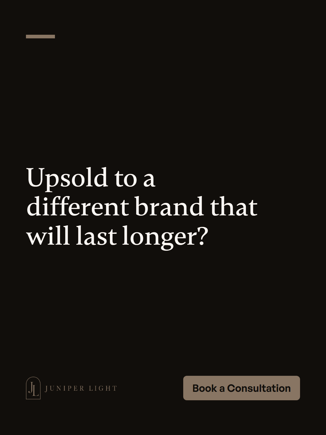
I was upsold to a different brand that I was promised will last longer…
I had a lot of questions because I was nervous…
I hated that I always looked like I was frowning…
…instead of rushing or overdoing anything…
Open every ad on their problem. Test 5 to 8, and change only the first line.
All 32 hooks, with the quotes they came from, are in MESSAGES.md in the kit.
Licensed nurses, a light first step, and the price in writing first.
The logo must look the same everywhere. These pages show every version and when to use each one.
Full color on light backgrounds. Reversed on dark backgrounds. Use one of these two whenever you can.
The symbol from the logo, on its own. Use it where the full logo would be too small to read.
 96px64px
 32px favicon16px favicon
Pick the version that is easiest to see on what is behind it.


Leave empty space around the logo. Nothing goes in it: no text, no edges, no other logos.
xxxx
x is one third of the logo's height. Keep at least x empty on all four sides.
160px wide on screens
1.25 in wide in print
Any smaller and the details blur. Use the icon instead.
Use the version named under each background.
Each of these makes the logo look cheap or fake. Use the files as they are.
NEW! SALE TODAY
The brand color comes from the logo. The grays and alert colors are built to match. Use them in the amounts shown.
HEX and RGB are for screens. CMYK is a starting point for print: ask your printer to match the HEX and send a proof.
Lighter and darker steps for backgrounds, borders and hover states. The outlined step is the brand color itself.
Mostly calm background, a strong share of Stone, and Ink for text.
#336941 · Done, saved, in stock
#C69D63 · Check this, running low
#A35F56 · Failed, sold out, delete
#437AA6 · Tips and notices
Use these pairs for words. "Big text only" means headlines.
The mark, repeated. Use it to fill big spaces so they still look like the brand.
Never put the logo straight on a pattern. Set it on a solid block of color on top.
Two typefaces, used the same way every time. Both are free, and the font files are in the fonts folder.
For headlines and big moments. Free on Fontshare.
A light classical serif like the capitals in the logo, calm at large sizes.
For paragraphs, buttons and everything else. Free on Fontshare.
Licensed nurses, a slow first visit, and the price before anything starts.
A clean, open sans that stays easy to read in small sizes.
Pixels for screens, points for print. The top size is drawn smaller here to fit.
How the two fonts work together on a page.
Licensed nurses, a slow first visit, and the price before anything starts.
Body text stays at 16px or larger on screens. Keep lines short enough to read in one glance. Links use Stone 700.
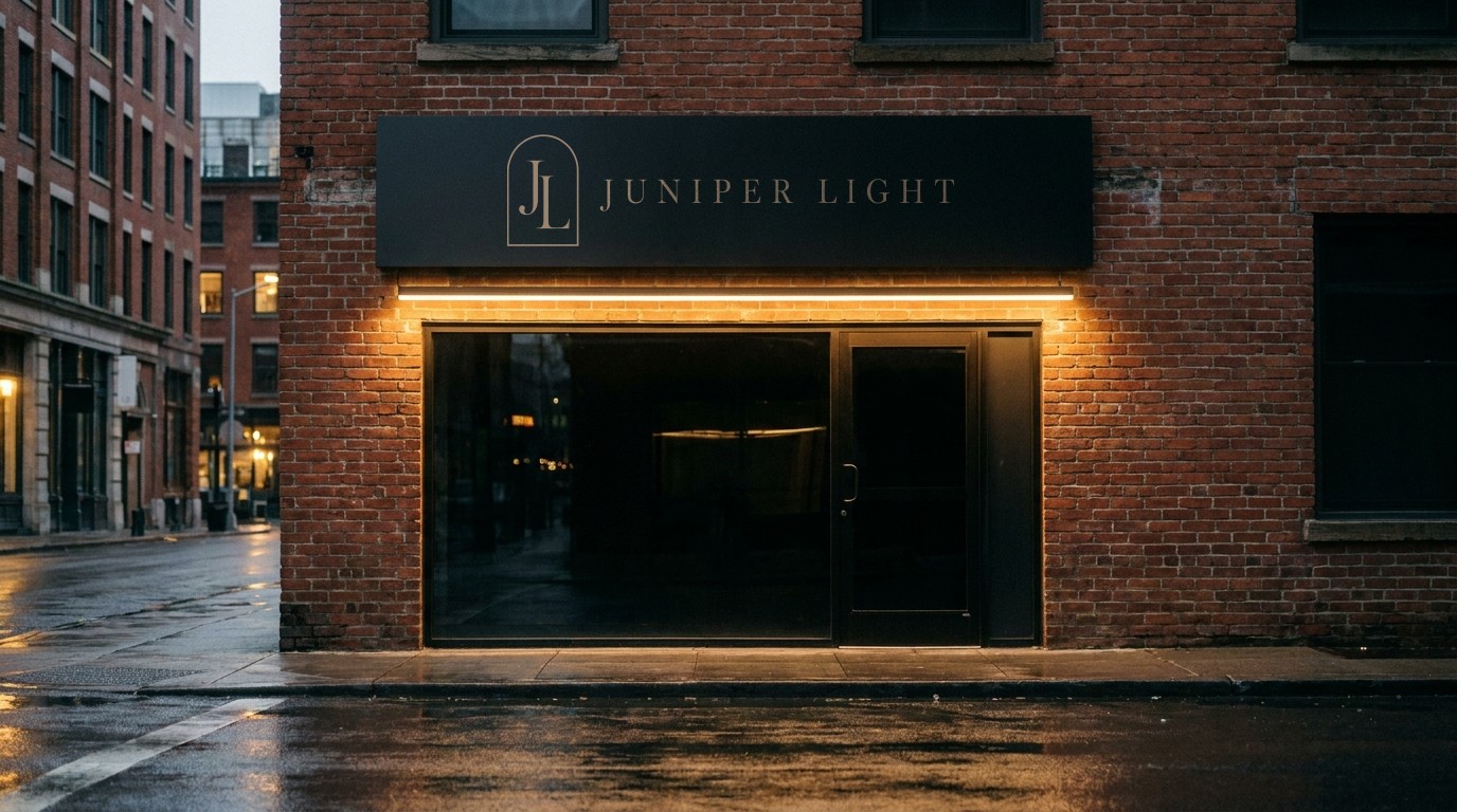
Book a ConsultationThe brand on signs, paper, things people hold and wear, and a billboard. Drawn from the same colors, fonts and logo.
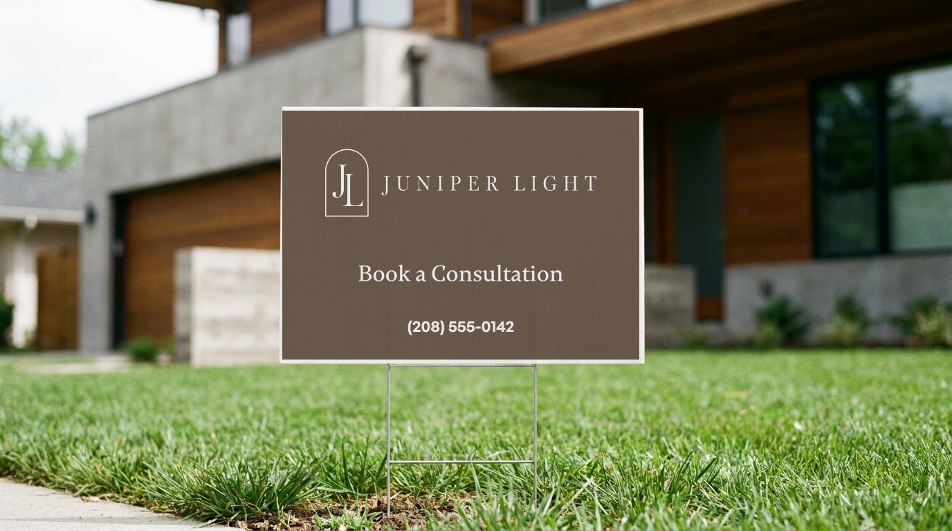
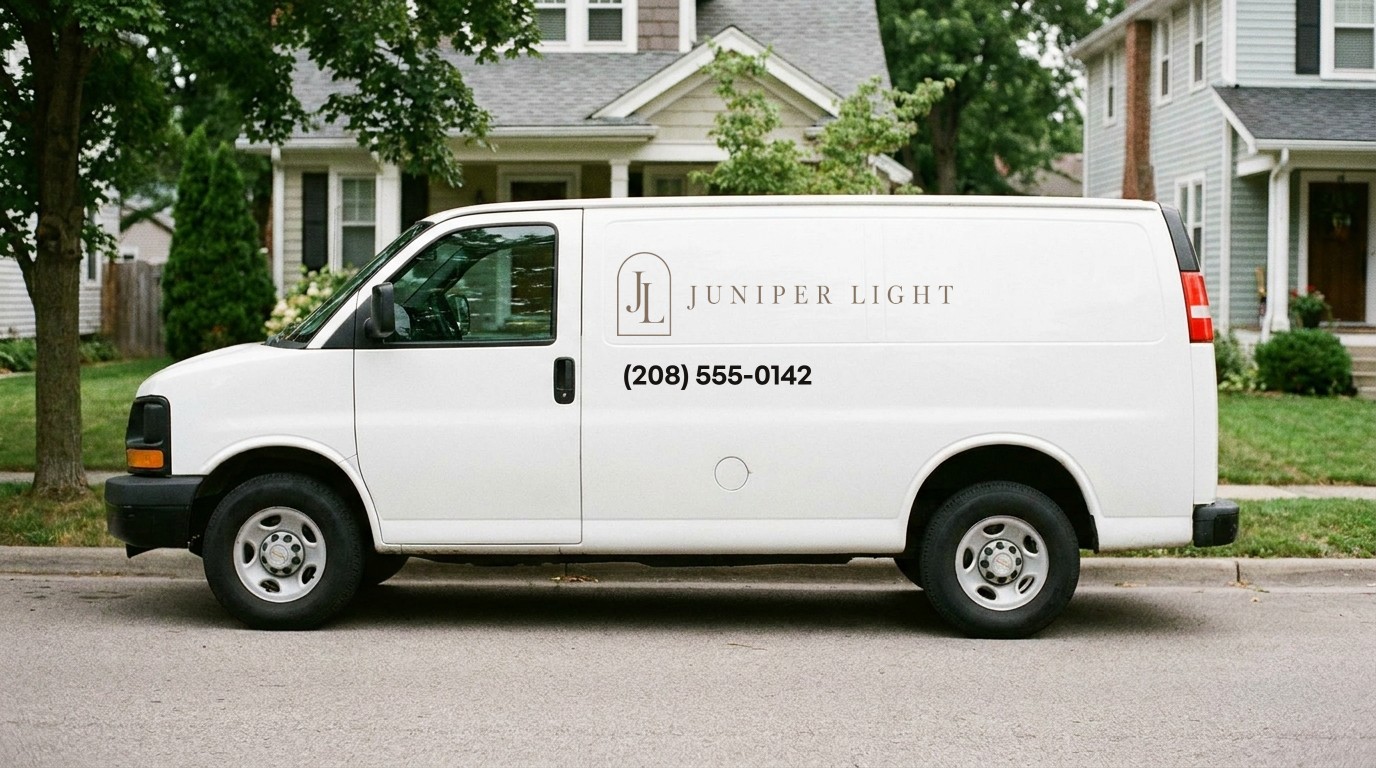
A shop or office sign, a yard sign and the work van. One logo, one line, one way to reach you.
3.5 × 2 inches. The logo alone on the front, the details on the back.
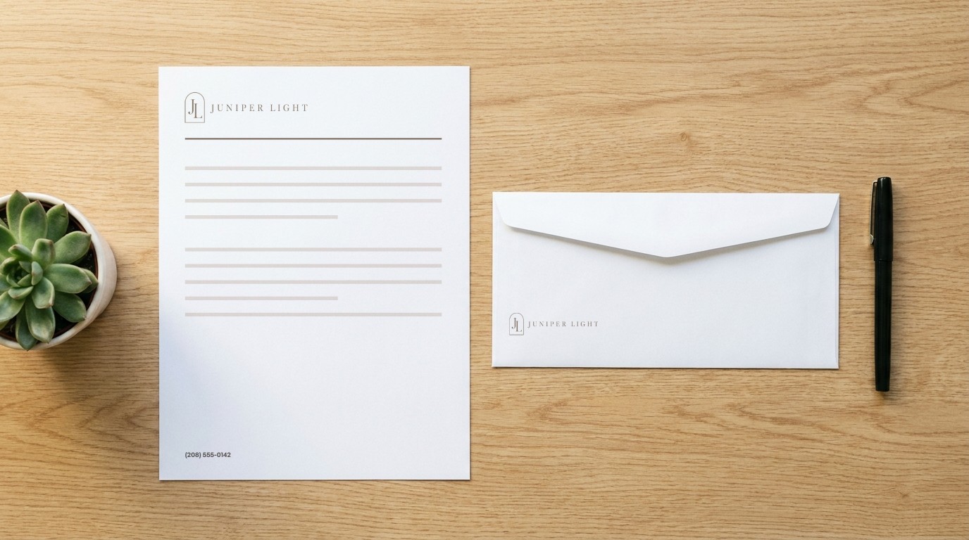
A letterhead (8.5 × 11 in), a #10 envelope and an email signature.
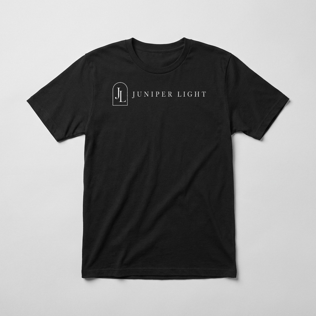
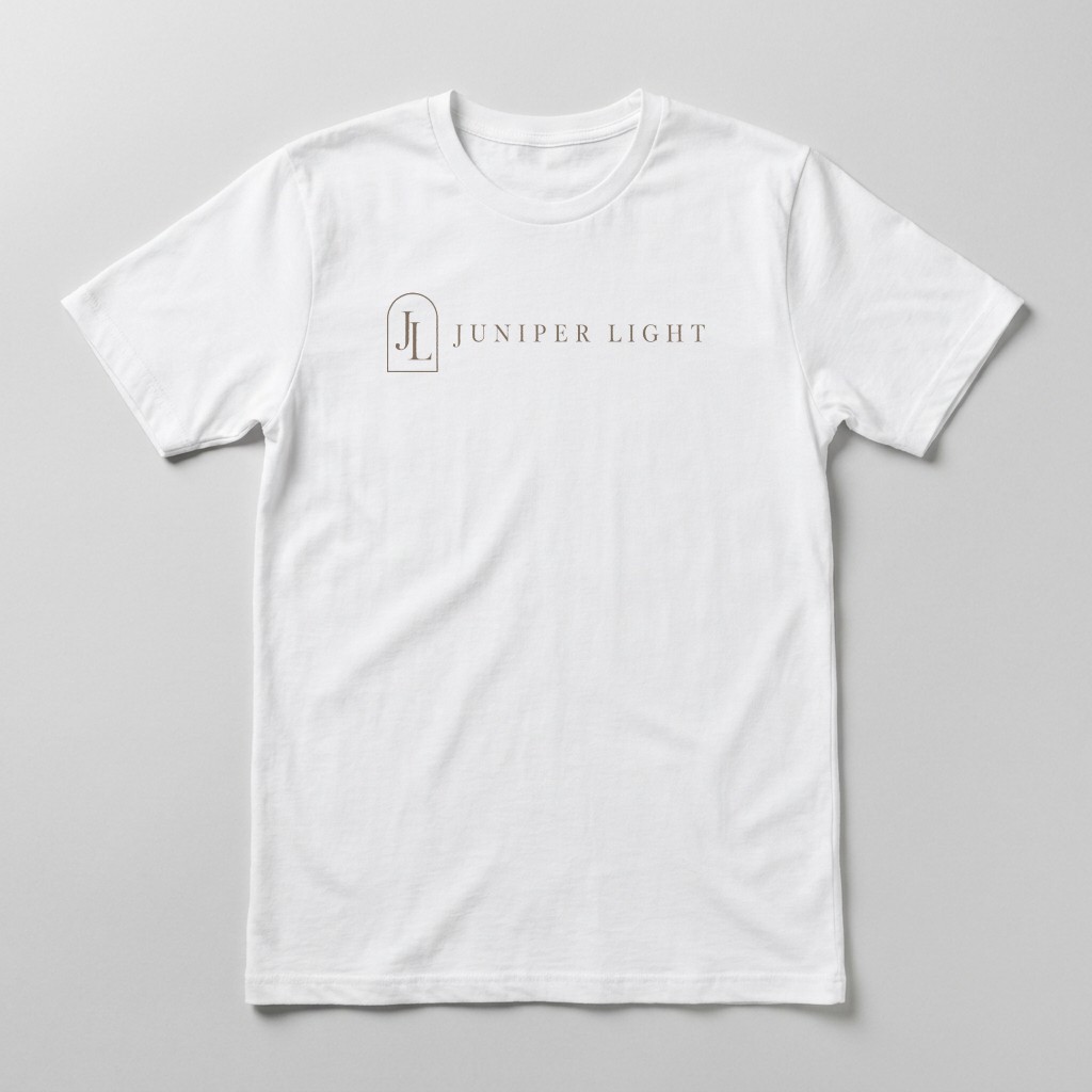
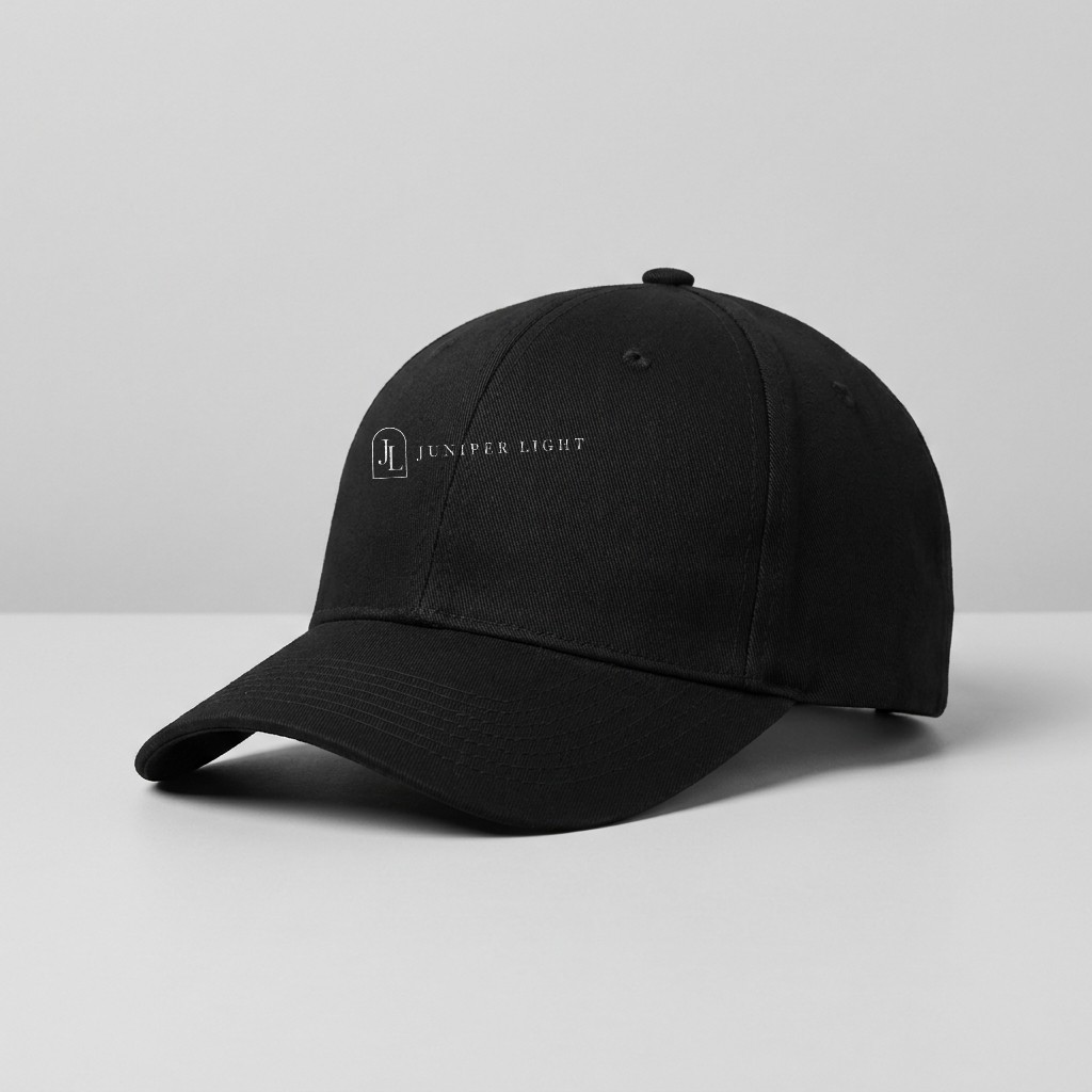
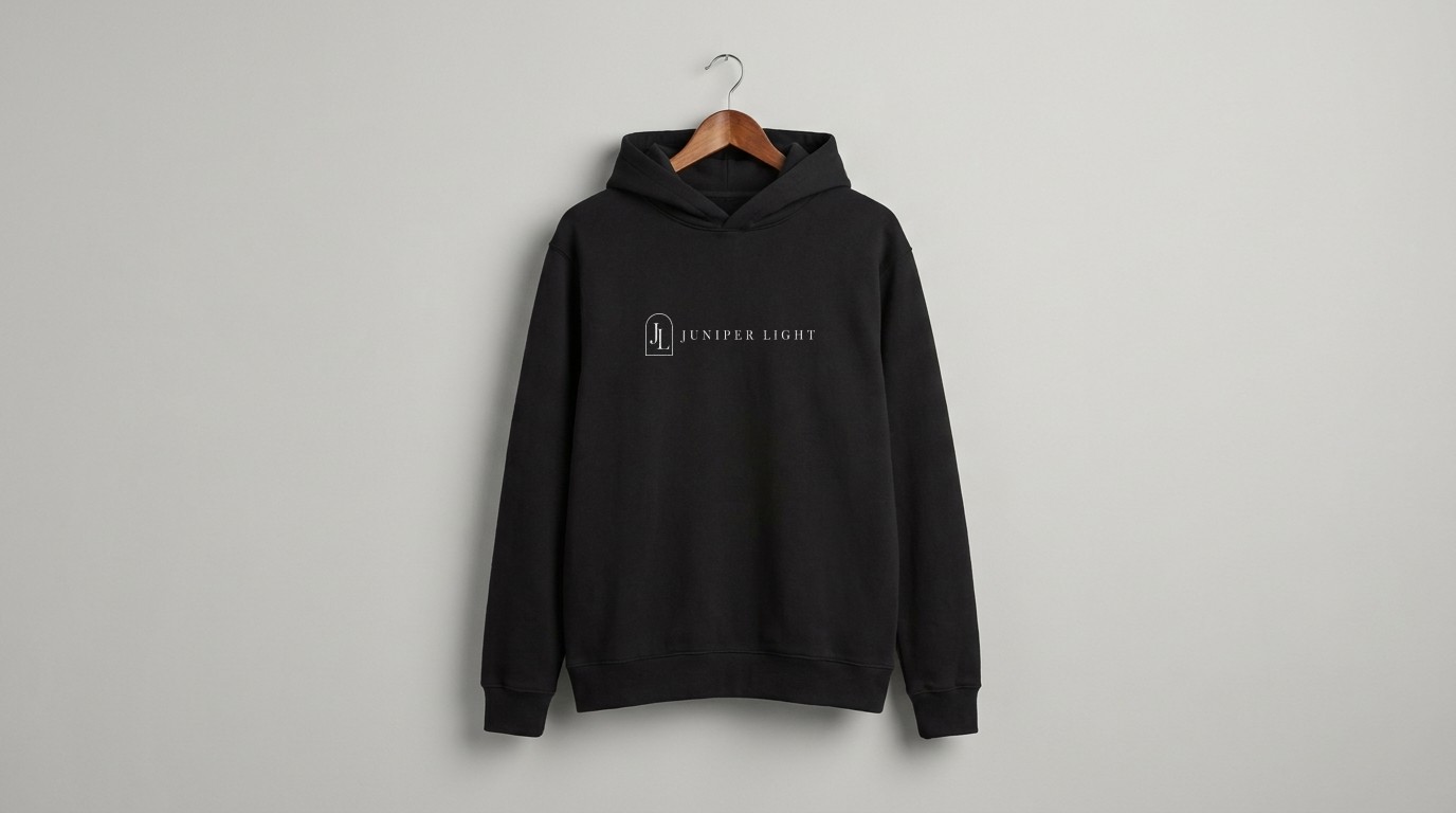
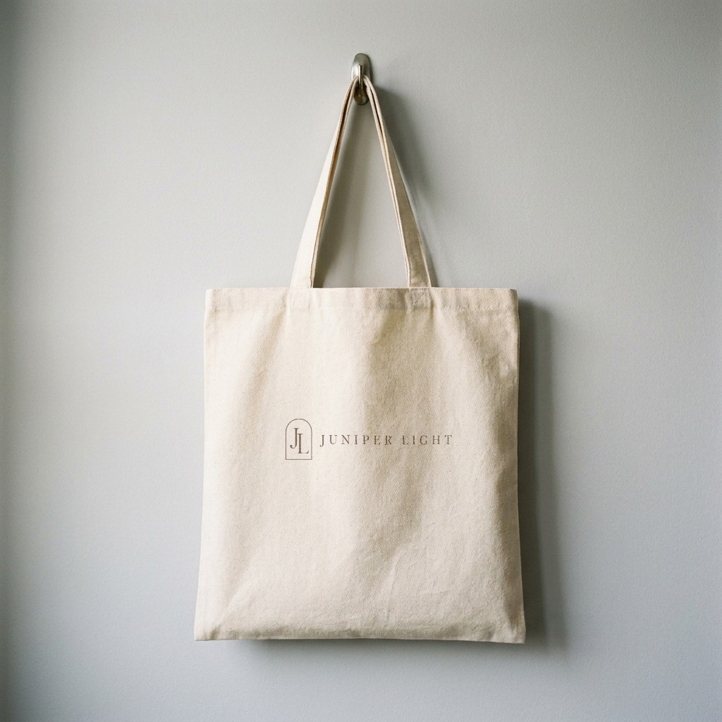
The logo on things people wear: reversed on dark cloth, full color on light.
A hoodie for cold mornings and a tote people carry around town.
Talk like a kind nurse who has done this many times. Warm, plain and unhurried.
Never: pushy, clinical, hype.
You tell us what bothers you. We explain the options and the price. Then you decide.
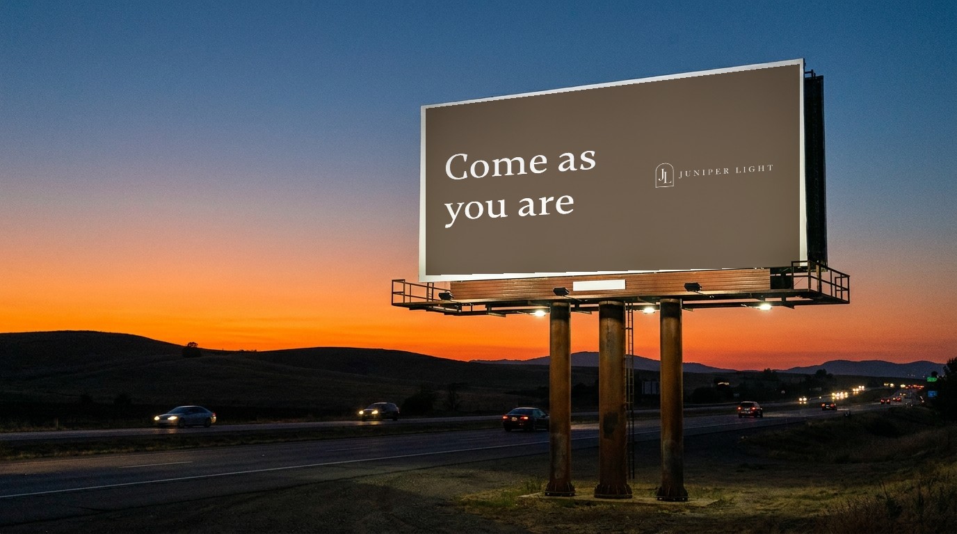
A 48 × 14 ft bulletin. Seven words or fewer: drivers read it in about five seconds.
Spacing, grids and shapes make separate pieces look like they came from one brand.
Every gap and padding is a number from this list. Every step is a multiple of 4px, so things line up.
Where things sit on a web page and on a social post.
The arch in the logo is soft at the top, so corners are gently rounded.
2px lines with round ends. Use one icon set with the same line weight everywhere.
The system on screens: buttons, forms, social posts and a website.
The same shapes and colors on every screen.
Licensed nurses, a slow first visit, and the price before anything starts.
Your first visit →Each platform below shows the version that fits its frame. Every file is 1080 × 1080 and fits inside every circle.

Keep what matters inside the dashed box. The gray circle is your profile picture.
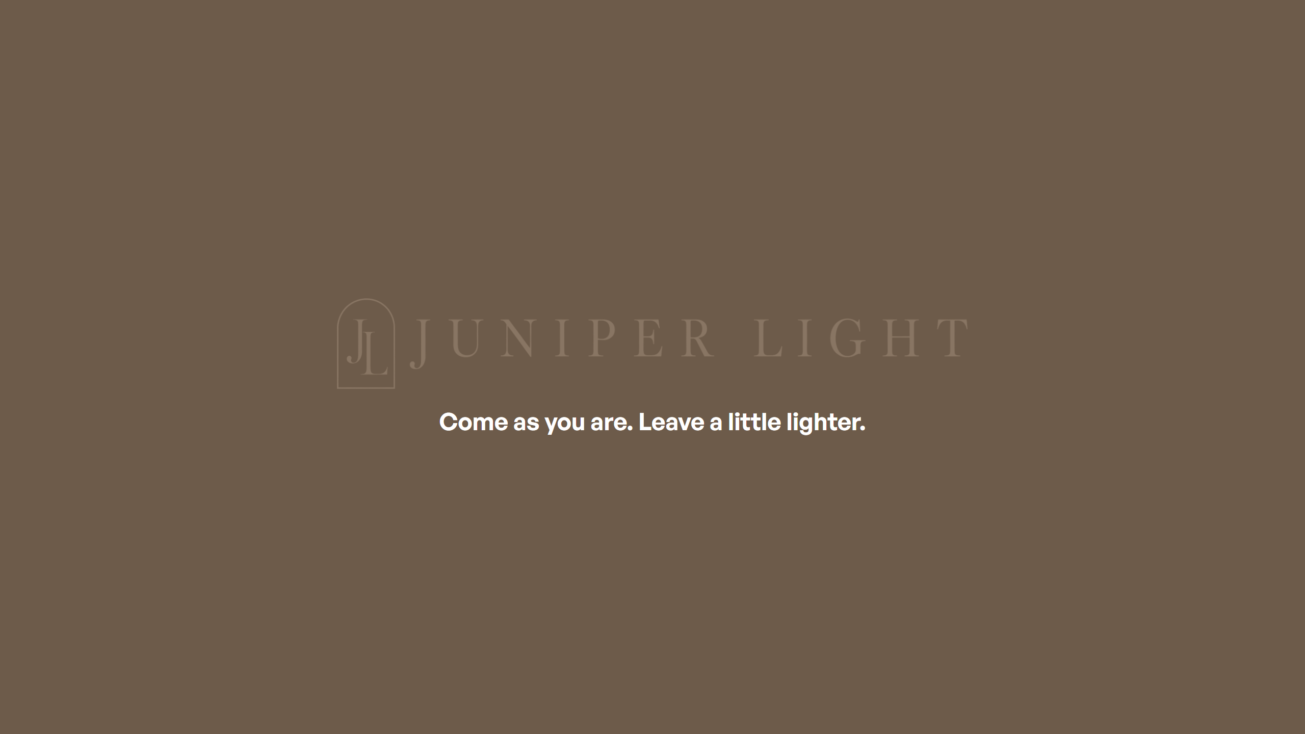
Open on their problem, in their words. Keep the logo small.
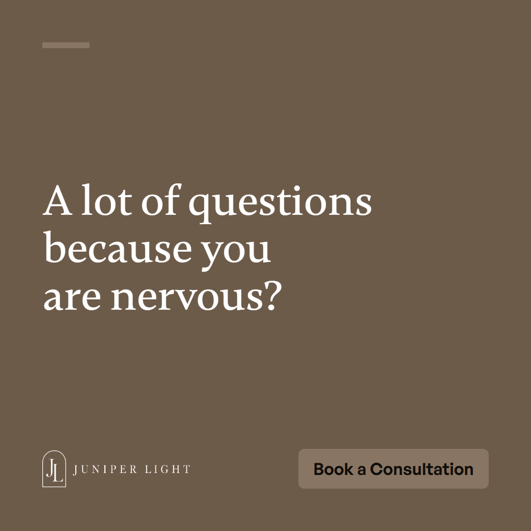
Links, landscape posts, video covers and Google updates.
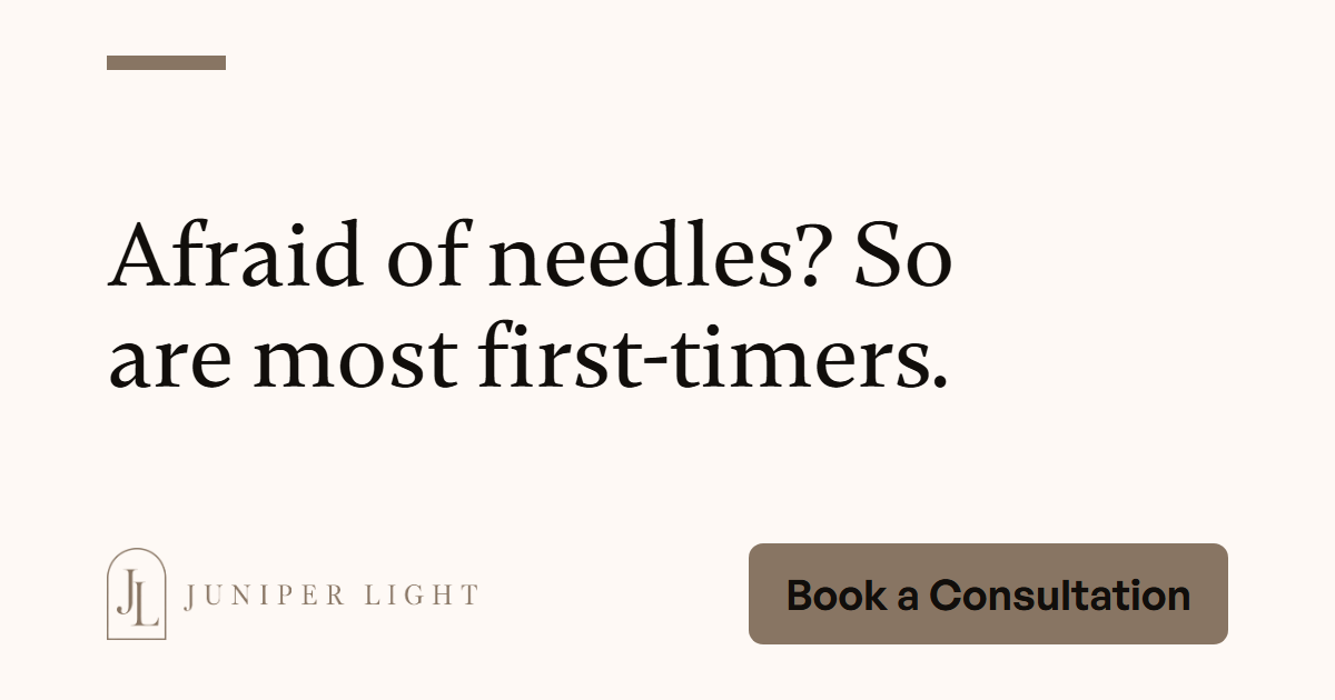
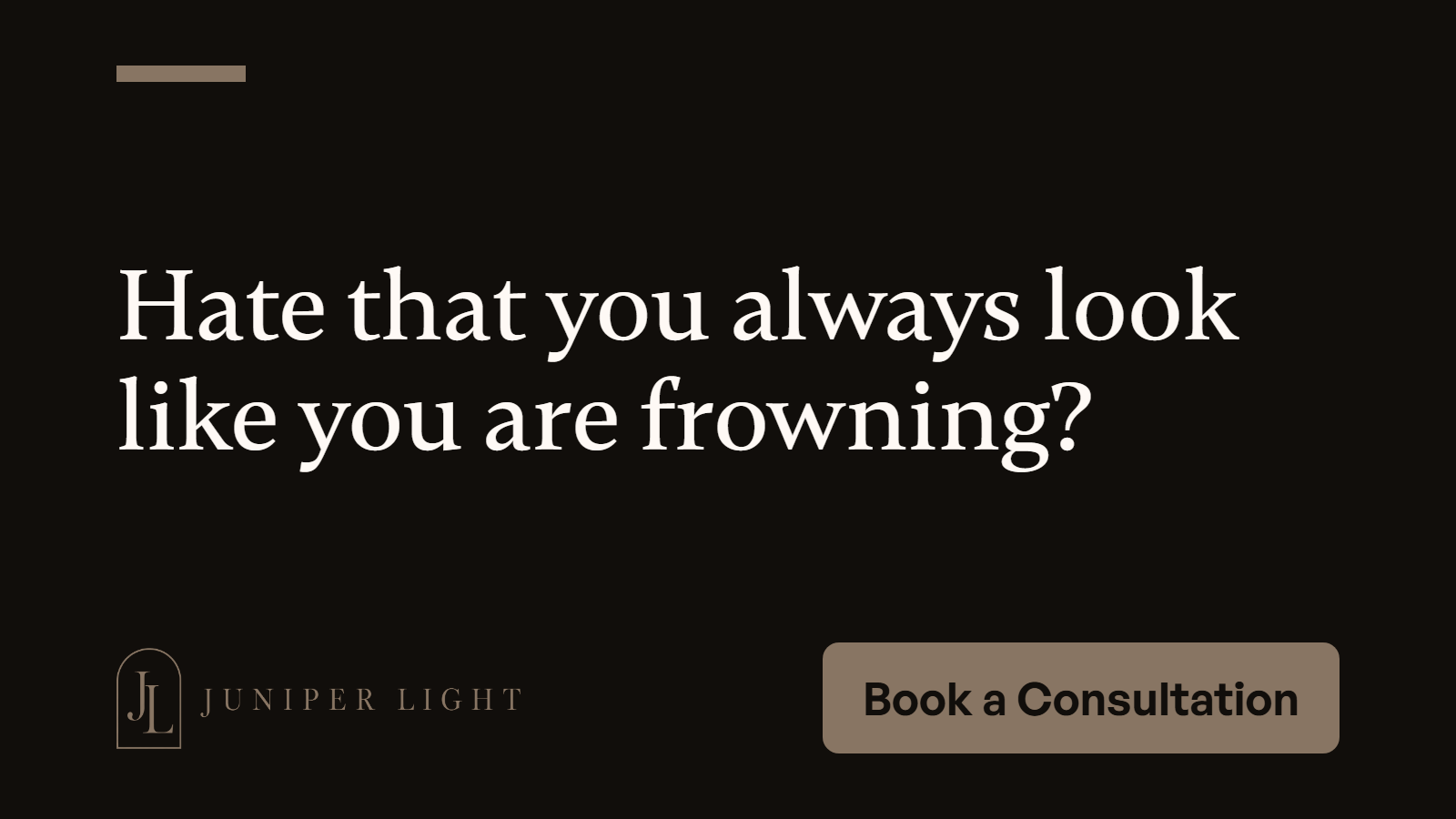
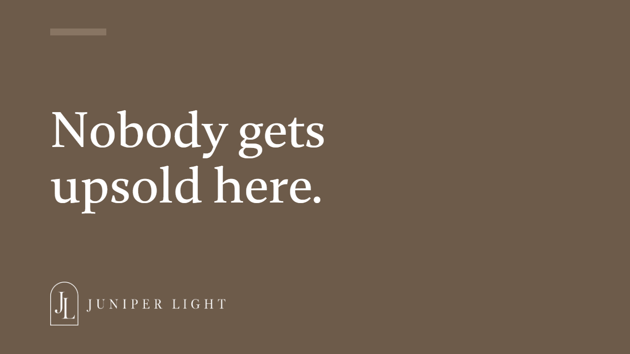
The home page, top of the screen.
Juniper Light TreatmentsThe TeamAboutContactBook a Consultation
Licensed nurses, a slow first visit, and the price before anything starts.
Pale stone, warm wood and morning light. Places, never faces.
Everything is in the "Juniper Light brand kit" folder and zip. Hand it to anyone who makes things for the brand.
--color-primary: #887563;
--color-ink: #110E0B;
--color-paper: #FEF9F5;
--font-display: "Gambetta";
--font-body: "General Sans";
--text-h1: 3rem;
--text-body: 1rem;
--space-md: 1rem;
--space-xl: 2rem;
--radius-md: 8px;